
Colour Theory in Graphic Design
Have you ever wondered why certain colour combinations make you feel a certain way? Or why some designs are visually appealing while others are not? This all comes down to colour theory: a fundamental principle in graphic design.
So, what is colour theory in graphic design?
In this guide, we’ll look at:
- What colour theory is
- Why colour theory is important in graphic design
- The key aspects of colour theory
- How to use colour theory in your designs
Let’s dive in.
What is Colour Theory?
Colour theory is the study of how colours mix, match, and contrast with each other to create visually appealing and harmonious designs. It involves understanding the colour wheel, colour schemes, and the psychological and cultural implications of different colours.
Why is Colour Theory Important in Graphic Design?
Colour is a powerful tool that can evoke emotions, influence perceptions, and guide the viewer’s eye. A well-executed colour scheme can make a design more memorable, persuasive, and visually appealing.
On the other hand, a poorly chosen colour palette can detract from the overall message and leave a negative impression.
Here are some reasons why colour theory is so important when it comes to graphic design:
- Communication: Colours convey messages and evoke emotions. Understanding colour theory helps designers communicate effectively with their audience.
- Harmony: Colour theory helps create balanced, harmonious designs that are pleasing to the eye.
- Contrast: Understanding colour contrast ensures that designs are readable and accessible.
- Branding: Colours play a significant role in brand identity. Applying colour theory helps create strong, recognisable brands.
At Image Box Design, a leading graphic design agency based in Berkshire, we offer a range of services from branding, logo design, catalogues, brochures, flyers, business cards and more. If you’re looking for an expert to help design your project or with your print design, get in touch today!
Key Aspects of Colour Theory
Now we know what colour theory is, and why it’s important in graphic design, let’s look at some of the key aspects:
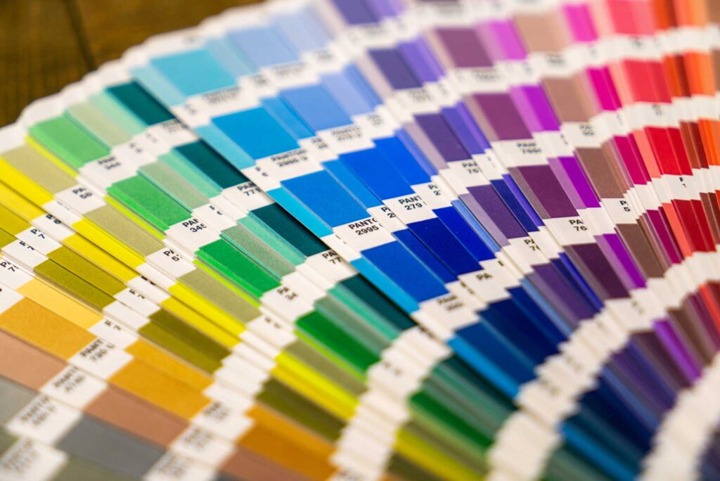
1. Colour Wheel
The colour wheel is a visual representation of colours arranged according to their chromatic relationship. It consists of primary colours (red, blue, and yellow), secondary colours (green, orange, and purple), and tertiary colours (mixtures of primary and secondary colours).
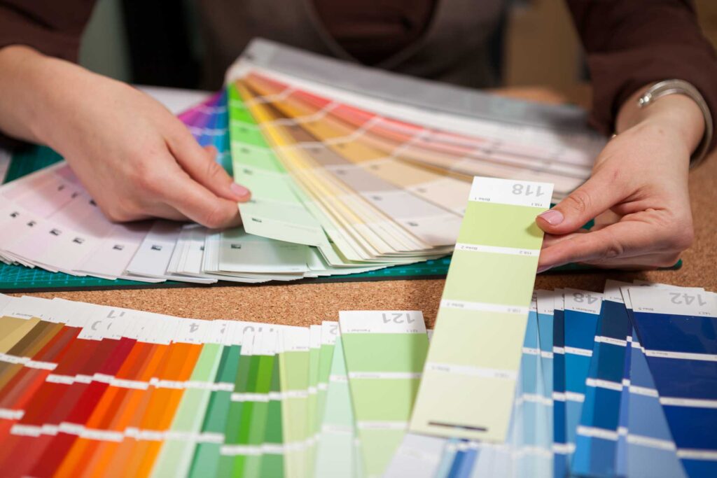
2. Colour Schemes
Colour schemes are combinations of colours derived from the colour wheel. Common schemes include:
- Monochromatic: Variations of a single colour.
- Analogous: Colours that are next to each other on the colour wheel.
- Complementary: Colours that are opposite each other on the colour wheel.
- Triadic: Three colours evenly spaced around the colour wheel.
- Tetradic: Four colours consisting of two complementary pairs.
3. Colour Harmony
Colour harmony refers to the pleasing arrangement of colours in a design. It creates a sense of balance and order, making the design visually appealing. Harmony can be achieved through the use of colour schemes and understanding the relationships between colours.
4. Colour Psychology
Different colours evoke different emotions and associations. For example:
- Red: Passion, energy, urgency.
- Blue: Calm, trust, professionalism.
- Yellow: Optimism, warmth, attention.
- Green: Nature, growth, harmony.
5. Colour Contrast
Contrast is the difference between colours that makes them stand out from each other. High contrast can create a strong visual impact, while low contrast can create a more subtle and harmonious effect. Contrast can be achieved through differences in hue, value (lightness or darkness), and saturation (intensity).
6. Colour Temperature
Colours can be categorised as warm or cool. Warm colours (red, orange, yellow) evoke feelings of warmth and comfort, while cool colours (blue, green, purple) evoke feelings of calm and serenity.
7. Colour Context
The way colours are perceived can change based on their surrounding colours. For example, a colour may appear brighter or darker depending on the colours around it.
8. Cultural Significance
Colours can have different meanings and associations in different cultures. For example, white is often associated with purity and innocence in Western cultures, but with mourning in some Eastern cultures.
9. Colour Models
Different colour models are used in graphic design, including:
- RGB (Red, Green, Blue): Used for digital screens.
- CMYK (Cyan, Magenta, Yellow, Black): Used for printing.
- HEX: Used for web design.
10. Colour Accessibility
Ensuring that colours are accessible to all users, including those with colour vision deficiencies, is crucial. This involves using high-contrast colour combinations and avoiding reliance on colour alone to convey information.
How to Use Colour Theory in Your Designs
- Define Your Brand: Your brand’s personality and values should influence your colour choices.
- Consider Your Target Audience: Understand your audience’s preferences and cultural associations with different colours.
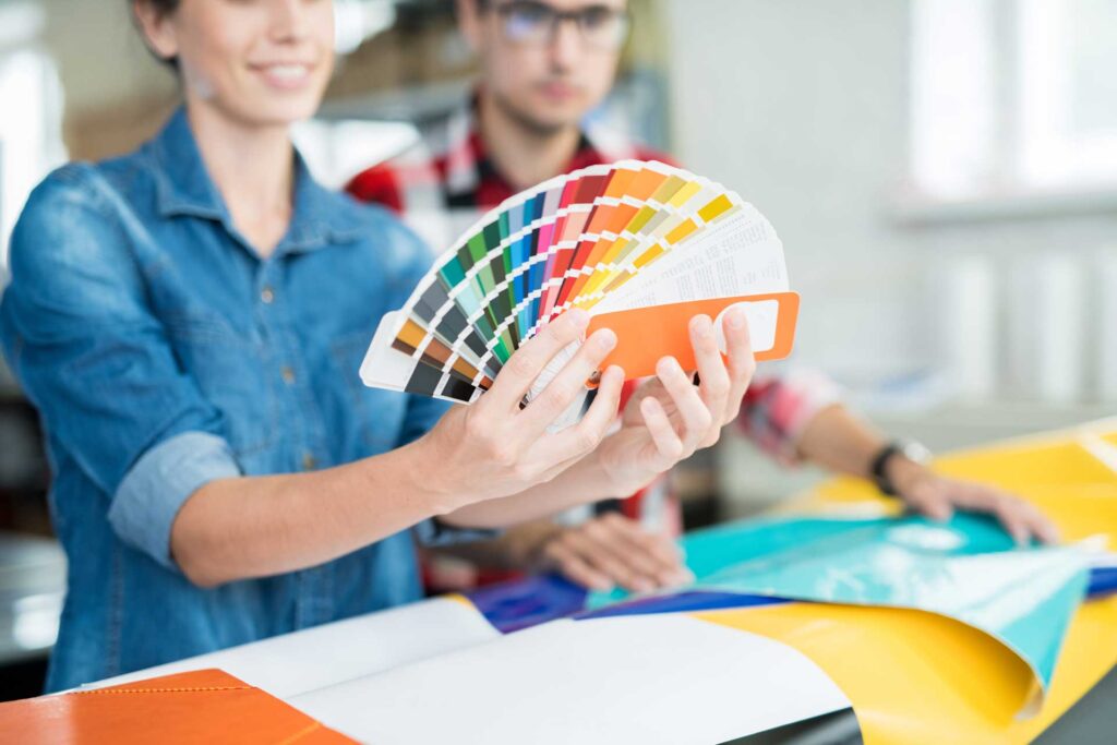
- Choose a Colour Palette: Select a colour palette that complements your brand and evokes the desired emotions.
- Use Colour Strategically: Use colour to highlight important elements, create a visual hierarchy, and guide the viewer’s eye.
- Test and Iterate: Don’t be afraid to experiment and refine your colour choices.
Looking to Elevate Your Designs?
Mastering colour theory is like learning a new language. It opens up a world of possibilities, enabling you to communicate effectively, evoke emotions, and create stunning designs that resonate with your audience.
Whether you’re designing a logo, a website, or a brochure, understanding and applying colour theory can transform your designs from good to exceptional.
If you’re looking to take your graphic designs to the next level, get in touch with us at Image Box Design.
Frequently Asked Questions
What is Colour Theory in Graphic Design?
Colour theory in graphic design is the study of how different colours interact and create harmonies, guided by the colour wheel Sir Isaac Newton developed in 1966. It involves the use of colour, from primary to tertiary colours, to create visually appealing designs. Graphic designers use colour theory to select colour combinations that enhance typography and digital products, ensuring cohesive and impactful designs.
How Do Colours Affect the Mood of a Design?
Colours significantly affect the mood of a design through colour psychology. Warm colours like bright yellow evoke energy and excitement, while cool colours bring a sense of calmness. The additive colour model helps designers understand how the human eye perceives different colours, allowing them to create designs that convey specific emotions, whether for social media or logo design.
Can You Explain the Role of Colour Harmony in Design?
Colour harmony is crucial in design as it creates a balanced and pleasing visual experience. By using colour theory, designers can create complementary colour schemes, analogous colour schemes, or triadic colour schemes that avoid a feeling of chaos. Understanding the colour spectrum and the relationships between opposite colours ensures that the use of colour enhances the overall design aesthetic.
How to Choose a Colour Scheme for Your Brand?
Choosing a colour scheme for your brand involves understanding colour psychology and the schematic way colours interact. Monochromatic schemes or combinations of colours that include a secondary colour can create a strong brand identity. Consider the name of a colour and its cultural significance to ensure your brand colours resonate with your audience, reflecting the different natures of your brand effectively.
Related Guides:
- What Are Bleed and Crop Marks?
- 12 Key Advantages of Print Advertising
- What Makes a Good Poster?
- What is Brand Identity?
- What is Graphic Design?
- What is Logo Design?
- What is an Infographic?
- Why Branding is Important for Your Businesses Success
- 10 Signs Your Business Needs a Rebrand
- 7 Reasons Why Typography is Important
- 15 Tips For Choosing The Best Graphic Design Company
- 17+ Reasons Why Graphic Design is Important for Businesses
- How to Make a Magazine
